In recent years, we’ve seen a proliferation of “purpose-oriented” initiatives pursued by companies, in some cases with authenticity, in others with cynicism. Now the wind has changed and many organizations are dismantling, for example, their DEI programs. As designers, how can we handle these counter-narratives? How can design avoid becoming complicit in this “purpose-washing”? Can you share specific examples of projects that have resisted these fashion cycles?
While Trump is a compulsive liar, paradoxically he has also trashed the usual pretense. It seems that all the pretending around playing fair is no longer useful. What works now politically (and probably always has) is an alignment of economic grievance with hostility to redressing outstanding injustice. Doesn’t the fickleness of corporations dumping their DEI programs actually render redundant questions of authenticity versus cynicism? After all, where is the inauthenticity in a monolithic ad-tech company, for example, scrambling for more profit and power? Isn’t it just a structural obligation? And isn’t the dismantling of the state and civil society compatible with this imperative? The billionaire tech bros and neo-fascists plan to supplant the democratic state. I don’t think we should mistake confected chaos with nihilism. Like a rouge horror film lab-experiment, their agenda is finally coming to life.
The cruelty of ceasing humanitarian foreign aid, deporting immigrants, withdrawing services relied on by the poor is all just “efficiency”. The democratic state needs authenticity but the oligarchical corporate state doesn’t. It just needs scapegoats for inequality and oppression – contrived enemies that are being punished more than its supporters. In response to Trump’s plan to turn Gaza into a “Riviera of the Middle East” (a plan that by definition includes mass murder, ethnic cleansing and theft), Australia’s conservative opposition leader, Peter Dutton, praised Trump as a “big thinker” thinking “out of the box”. But where’s the fresh thinking in the ultra-wealthy wanting to further enrich themselves? That is the actual box. Isn’t it a kind of sadomasochism for designers to compulsively cheerlead the priorities of the market economy? Mostly we’re designing against our best interests.
The design I want responds to the real needs of the inner life and material conditions of an individual, their communities and the environment. This design can come from anywhere and go anywhere, it’s off the rails and its aim is true, it’s inevitable and inexplicable. But the more we surrender to disengagement and cynicism, the less relevant our design becomes.
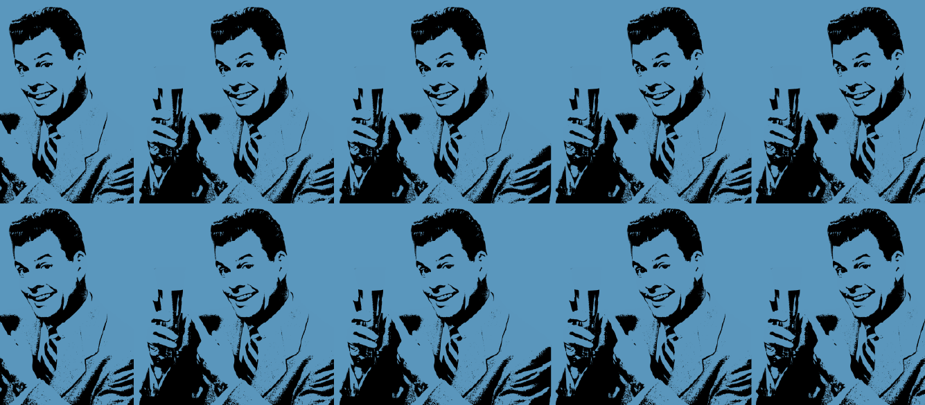
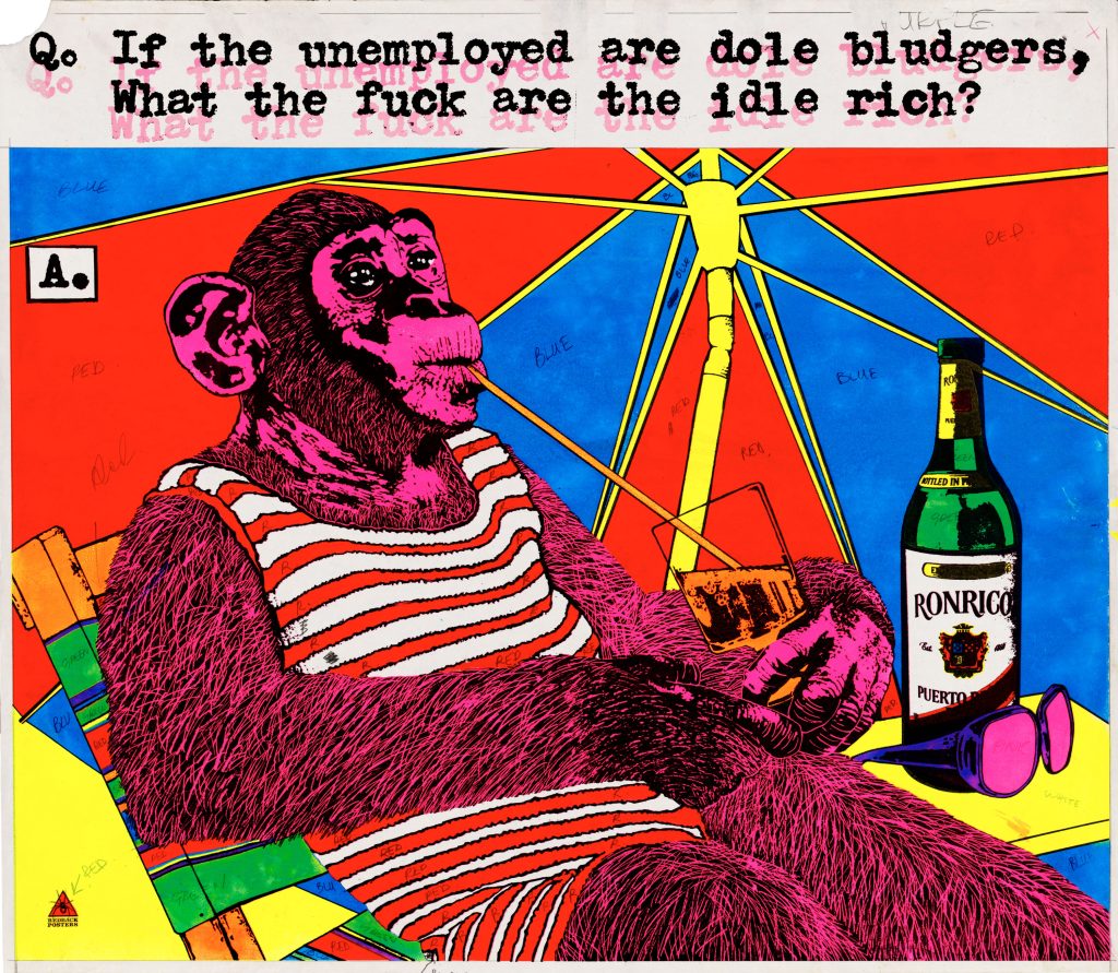
An important inspiration for Inkahoots was Australian poster collective Redback graphics. Redback produced pre-digital, confrontational political design – vivid screen-printed posters that struck out at rank hypocrisy and stuck up for neglected social and cultural values. They were an early model of socially committed design that I believe is even more relevant today.
In “Post Branding” you criticize many common branding practices. What are the three things an organization should “unlearn” before rethinking its communication? What should they be wary of?
First, we need to abandon the notion that there are no alternatives to branding. We’ve somehow bought the idea that the only viable method for the mass communication of collective identity is an undemocratic, exploitative and dehumanising ideology. We need to be wary of the way branding shapes our world view, imposing a neoliberal agenda, especially for civic and non-profit organisations and public institutions. Branding colonises these realms so that even those entities with explicitly independent or oppositional charters are displaced and transformed. Submission to branding’s dogma regulates critical agency and subtly redirects ethos. This happens to individuals too of course. As economic sociologist Wolfgang Streeck put it: “Good marketing co-opts consumers as co-designers… to haul more of their as-yet commercial idle wants, or potential wants, into market relations”. Branding reconstitutes non-corporate entities as market-tamed subordinates.
We need to understand brands as monetisable symbolic values shaping a kind of controlled freedom. The insidiousness of branding is not that it overtly imposes a system of desire, rather it focuses a consumer’s autonomy in a certain direction. It achieves this effectively with the help of what Bernard Stiegler calls psychotechnologies, marketing based-technologies that capture and destroy attention and care, making us ever more vulnerable.
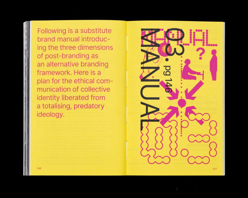
In What Is Post-Branding?, we set out to catalogue the damage caused by branding in order to develop an alternative, countercultural framework.
Research for our book included cataloguing branding’s harms in order to build an alternative, oppositional framework. Against branding’s secrecy, control, and distortion, we propose transparency and open-source principles. Against its tenets of exclusion, competition and consumption we offer participatory design approaches, including collaboration and social engagement. And to counter habits of homogeneity, publicity and commodification, we propose principles of diversity and commoning, including cohesion, dialogue, and criticality & imagination. We illustrate these principles with diverse case studies from around the world.
Communication is often set up based on trends or generational lenses founded on clichés. In the worst cases, the language of young people or the target audience is “imitated”, creating further distances. Can you give us examples of projects that have avoided this trap? From your design perspective, what could be the way forward?
Often when designers talk about cliché, we are condemning aesthetic or conceptual unoriginality, which, on the one hand I sympathise with – like plenty of designers, I strive for, and would much rather encounter, original expressions of a unique sensibility, rather than the tortured habits of mendacious fashion. But the problem of cliché is deeper, and its real menace is restricting critical thinking. US psychiatrist Robert Jay Lifton, defined clichés as “thought-terminating”. He was writing about the brainwashing of political prisoners inside totalist environments, and the way in which complex human problems are compressed into highly reductive, absolute-sounding info-bites for easy consumption and expression. Sound familiar? Contemporary market culture has spawned branding as a system of codifying and enforcing these cultivated corporate clichés. Advertising and branding are distilled expressions of market ideology that, as Lifton put it: “become the start and finish of any ideological analysis”.
When a project is born from a culture, either as a direct expression of its actors, or as a genuine collaboration with allies, extractive relations can be countered.
There are of course many, many examples of this kind of designing.
One example I like, not least because it unexpectedly comes from a typical, corporate design studio, Delhi’s Lopez Design, is an identity system for the Government of India’s 150,000 Ayushman Bharat health and wellness centres. Local cultural motifs are applied by local craftspeople to the sites’ exteriors. The modular identity promotes the expression of diverse regional character while maintaining organisational identification and recognition.
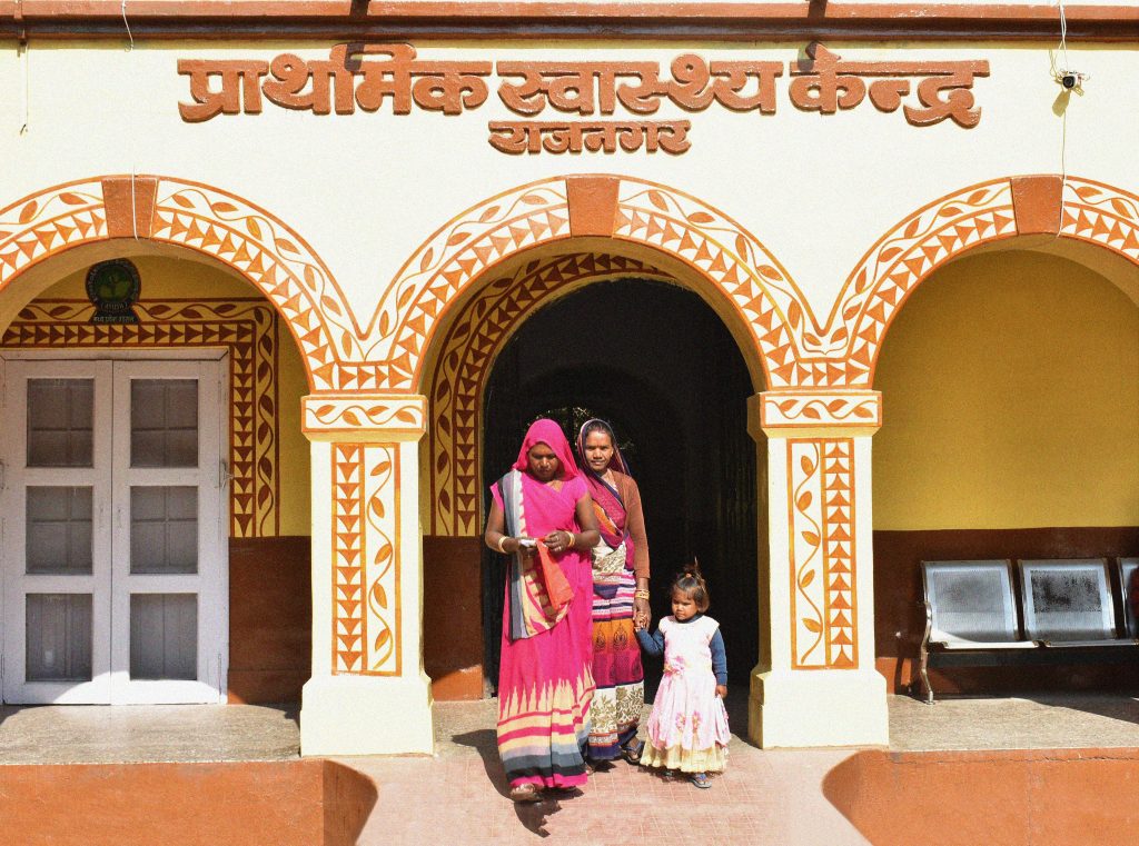
I can’t imagine corporate branding, with its top-down visual homogenisation and cultural standardisation, conceiving a better outcome, no matter how cool the logo or supporting fonts.
Your work is based on dialogue with communities and finding alternative paths. In your work with Inkahoots, how do you balance the need to be radical while remaining accessible? How do you avoid unconventional aesthetics becoming a cliché themselves? How do you intercept unconventional styles, languages, and aesthetics? And how can they be useful in creating dialogue, engagement, and “actions” with communities?
Aren’t “unconventional aesthetics” just an expression of the project’s particular circumstances filtered through the subjective personal sensibilities of the designer? I have never accepted the idea that a design artefact can emerge without a process of mediation with reality. I’ve never accepted the pretense of an objective, unmediated design outcome. Our goal is always to connect with other humans, and sometimes the more we universalize and generalise communication, the weaker the connection. If we think about the famous 1972 debate between Wim Crouwel and Jan van Toorn, a supposed conflict between rationality and subjectivity (Crouwel’s engineer to Van Toorn’s artist ) – to me, the whole binary is erroneous. For one thing, Crouwel’s design was never merely rational and objective (just look at those playfully inventive custom letterforms), it was clearly a deeply personal creative expression, no matter how “structural” or “cellular”.
The highly original typography and inventive grid-based strategies were the distinctive outcome of an individual personality in a specific historical moment. Crouwel is celebrated now for his expressive, if orderly, experimental design, not of course for some scientific graphic formula. The championing of “neutrality” is at best disingenuous and at worst dangerous.
What are the most interesting effects on people and communities that you’ve managed to generate with your work? What have been the most unexpected feedbacks you’ve received from communities? Could you also share some experiences about resistances or failures encountered?
Most projects are probably a messy mix of success and failure. One that’s on my mind today is an older collaboration with a neighborhood community organisation, artist Michael Candy, and local people experiencing homelessness. The current news headlines in Brisbane are all about councils clearing rough sleepers out of parks and taking their tents and possessions, fining them thousands of dollars, essentially making it illegal to be homeless.

Back in 2012 we staged a public intervention – protesting the official harassment of the homeless by the Brisbane City Council – on a prominent city site that had its bus shelter removed because it was used by the homeless as a safe haven. Bitter Bench was an archetypal public bench (but with the phrase “BITTER BRISBANE” engraved in large letters on the seat’s wooden slats) fitted with a solar powered proximity activated audio system that, as pedestrians approached, attracted their attention by triggering the recorded voices of homeless men and women telling their stories. The bench then tilted forward when anyone attempted to sit on it – kind of taking the idea of ‘hostile architecture’ to its logical conclusion.
The work was removed after a few days, but media interest forced the Council to publicly defend its record on homelessness: the introduction of homeless exclusion zones and discriminatory police move-on powers; homelessness program funding cuts; and the removal of public furnishings where the homeless sought refuge. The intervention helped focus attention on issues we routinely ignore, and resulted in most of the removed street furniture being reinstated.
What interesting interactions do you see between physical and digital, especially with the increasingly strong presence of generative AI? Is AI risking further standardizing global aesthetics? What risks and potentials do you see in your work in using these technologies?Does AI risk further standardising global aesthetics?
We don’t need AI to homogenize and standardize global aesthetics. Look at any branding studio (now most of the graphic design industry), for example, and the ideas, language and visual expression is utterly conformist, even interchangeable. You could randomly swap around the names of these agencies and most people wouldn’t notice. It seems to me like a sad and depressing waste of potential. Likewise, AI deals with the predictable – the merely probable, not the infinitely possible, let alone the ‘impossible’. But why shouldn’t design concern itself with better, alternative futures?
I’ve been thinking about how Douglas Rushkoff wrote that rejecting new software or hardware is seen to be the same as rejecting social norms – that it’s like a perverse choice to remain impotent, weak and unproductive. I’m hopeful that we can come to terms with both the real hazards and positive potential of untested tech. This will involve sometimes refusing ubiquitous monopolized technology.
I wonder if there is also a sense in which AI can’t really replace anything that’s worth keeping? Corporate design is already so generic and templated that, for me, it’s easy to imagine machine learning swallowing up this redundant labor. If we want to avoid AI stealing our jobs, we will need to keep our agency and make design that is more distinctively human, with clients that aren’t cancelling the future.
Could you share specific cases where design has actually catalyzed social change? What made these interventions successful?
Ok, let’s start, again, with branding and other forms of corporate propaganda – with where capital has overwhelmingly invested in design. If we want to consider design’s power we really need to start here. I’m assuming you mean design driving ‘positive’ social change, but let’s start instead with where the deployment of design actually has the most significant impacts, not because it’s intrinsically more difficult to realise productive social change with design, but because unimaginable resources, literally trillions of dollars every year, are spent on exploitative, extractive, defuturing design.
So, generally, what progressive or radical design lacks is resources, not necessarily efficacy. But what we do have is what all that money is trying buy in first place – real connections between people, movements of solidarity and common interest, mutual support, friendship and love. My sense is that design is most powerful when it joins, or grows from, a movement and is owned by a culture.
In our book What is Post-Branding? one of the examples we feature is Berlin’s right to the city campaign, a collaboration with design studio image shift, and local tenant initiative Kotti & Co, fighting unaffordable social housing in Kreuzberg’s Kottbusser neighbourhood. image shift designer Sandy Kaltenbourn isn’t just an imported creative enlisted to aestheticize protest messages, it’s his neighbourhood, his home and community. Since 2010 the campaign has achieved significant victories, such as a rentstop for all Berlin social housing flats, the remunicipalisation of the privatised social housing flats in Kreuzberg and beyond, and a Berlin wide referendum to democratize communal housing companies. The referendum on the expropriation of profit/stock market-run big housing companies also started at Kottbusser Tor.
Participation, collaboration and social engagement against exclusion, competition and consumption. Diversity and commoning against homogeneity and commodification. In spite of what we’re being taught and sold, there are better ways to design.